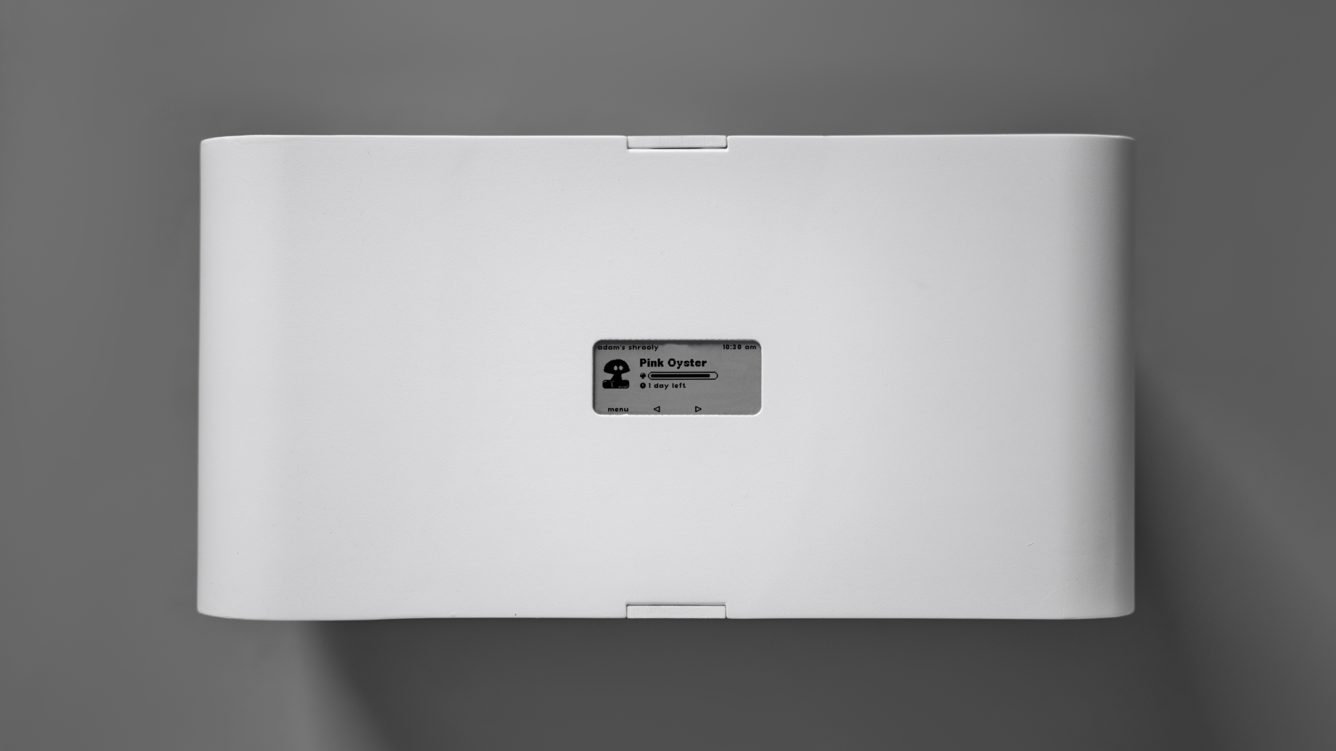
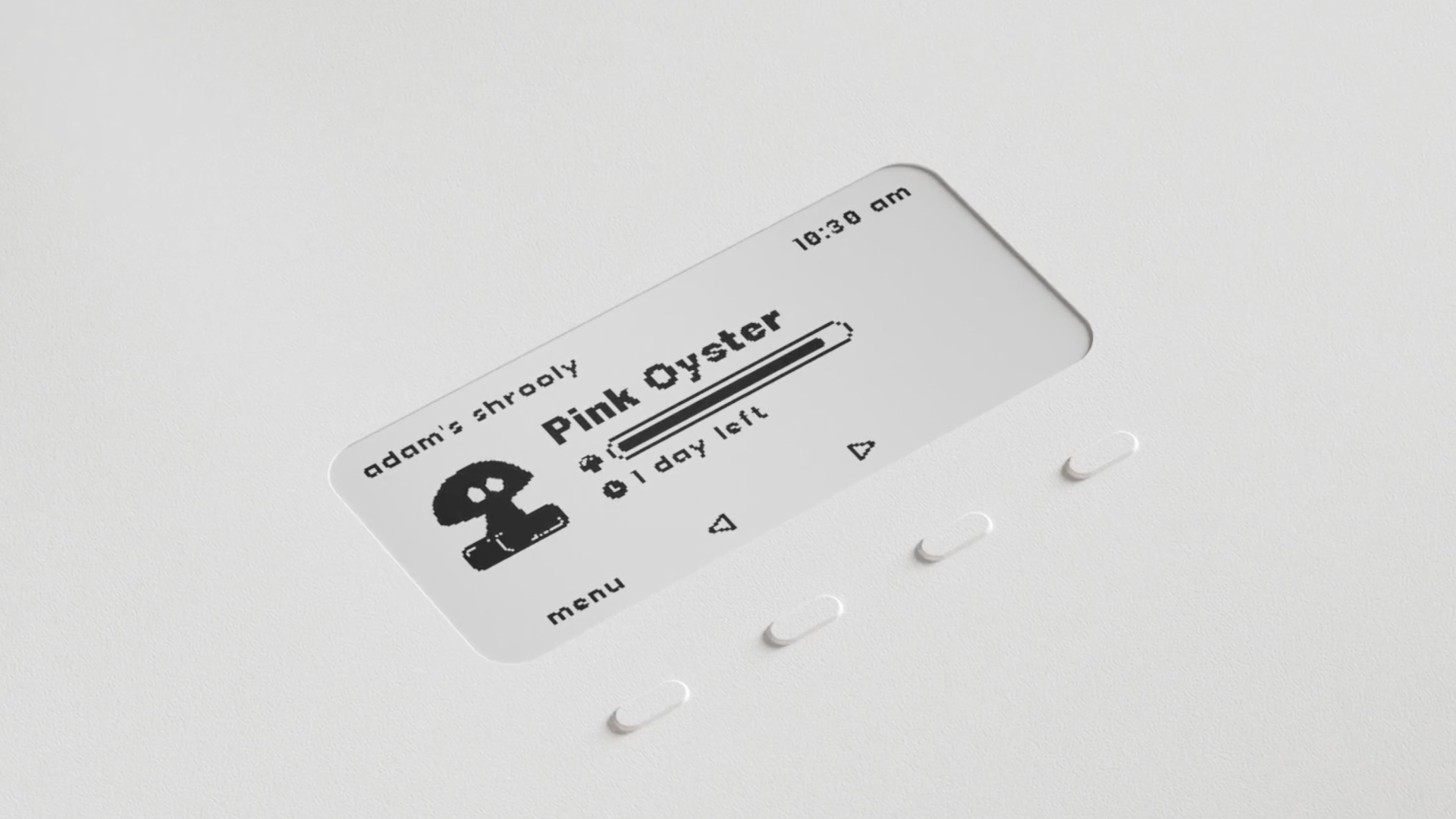
Designing the user interface for the Shrooly device’s e-ink screen was a unique challenge shaped by strict limitations in both screen size and display technology. The goal was to create an intuitive and brand-consistent experience within a highly constrained environment.
To ensure legibility and visual harmony on the small, pixel-based screen, I designed two custom fonts specifically tailored to the device’s exact resolution. Both fonts were derived from the Poppins Semibold typeface — Shrooly’s primary brand font — allowing for a cohesive look across all touchpoints while optimizing readability for the e-ink medium.
POPPINSBIT16 CUSTOM FONT
POPPINSBIT8 CUSTOM FONT


In addition to the typography, I illustrated a set of custom mushroom icons that represent the different cultivation programs available on the device. Each mushroom type is visually distinct and corresponds to the unique growing parameters of various species, helping users easily identify and select the appropriate program.
Project Manager: Ádám LIPÉCZ
UX/UI Design: Anna SÁRINGER
Developer: Dániel HATÁR
UX/UI Design: Anna SÁRINGER
Developer: Dániel HATÁR
Shrooly LTD, 2024